Diagrams
The Diagrams module lets you create visual architecture diagrams using an embedded DrawIO editor — fully integrated with your card inventory. Drag cards onto the canvas, connect them with relations, drill into hierarchies, and recolor by any attribute — the diagram stays in sync with your EA data.
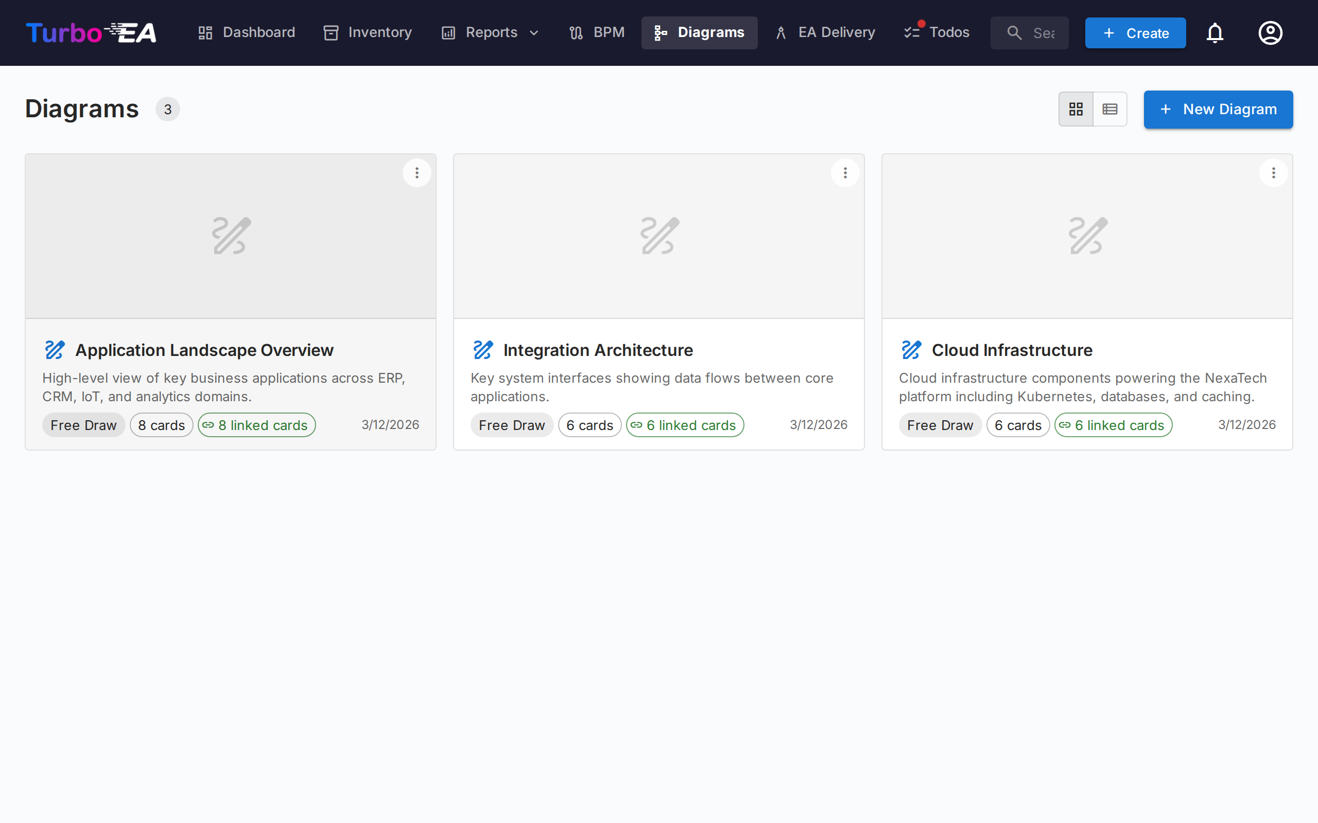
Diagram Gallery
The gallery lists every diagram as a compact card with a thumbnail, name, author, and the number of cards it references. Create, Open, Edit details, organise, or Delete any diagram.
Finding diagrams
- Filter sidebar — the left rail narrows the gallery to All diagrams, Created by me, or your Favorites. Collapse it to a slim rail with the chevron; on small screens the Filters button opens it as a slide-in panel.
- Search — the search box matches a diagram's name, its author, and the names of the cards drawn inside it, so you can find a diagram by what it contains.
- Sort — order by recently updated, recently created, or name.
- Favorites — click the star on any card to add it to your personal favorites; the Favorites filter then shows them all.
Groups
Organize related diagrams into groups — shared, workspace-wide labels. A diagram can belong to several groups at once. In card view the gallery shows each group as a collapsible heading, with anything unassigned under Ungrouped.
- Use Manage groups in the sidebar to create, rename, recolour, or delete groups.
- Use Add to groups… from a diagram's menu to place it in one or more groups (you can create a new group inline).
- Selecting a group in the sidebar filters the gallery to just that group.
The Diagram Editor
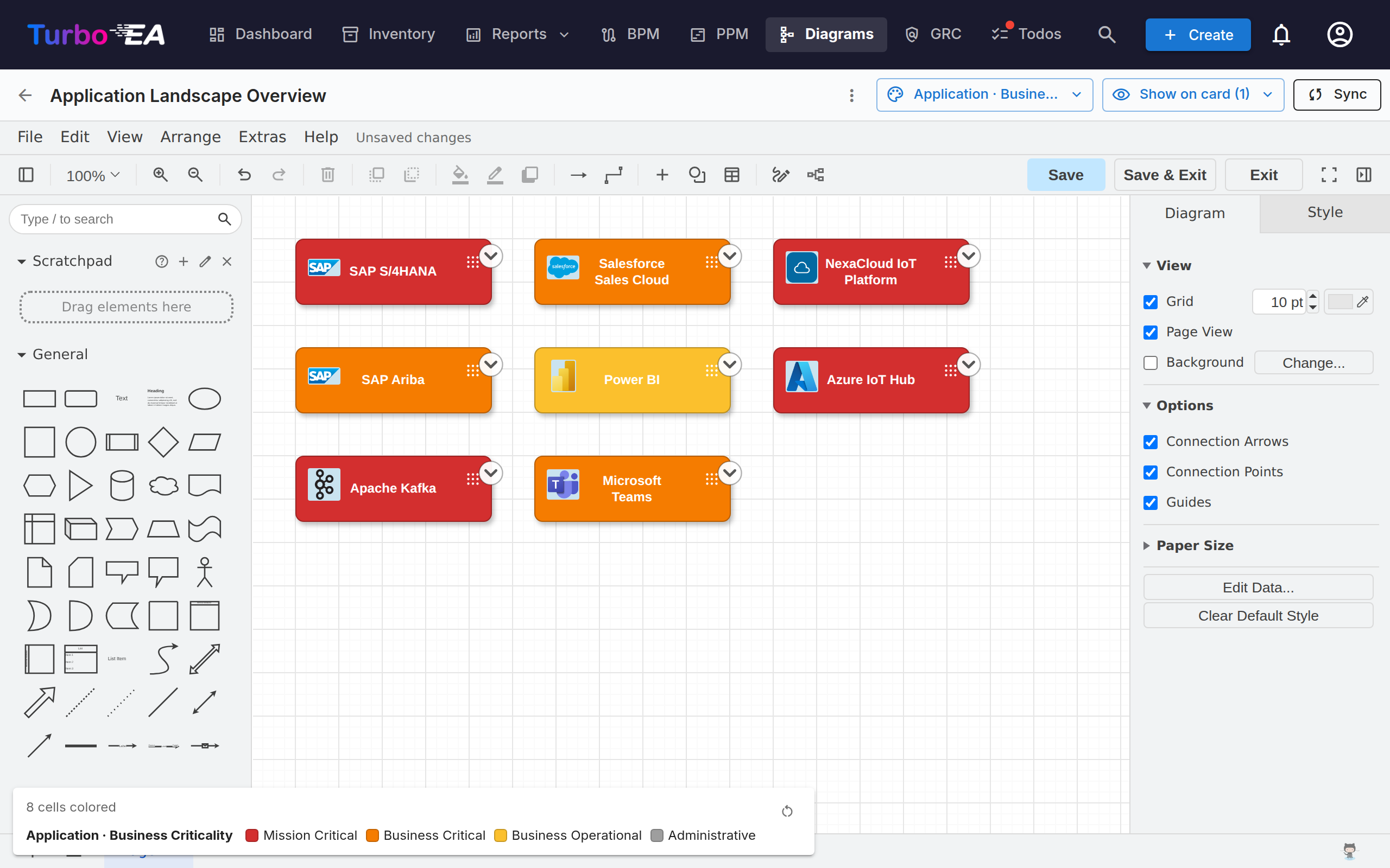
Opening a diagram launches the full-screen DrawIO editor in a same-origin iframe. The native DrawIO toolbar is available for shapes, connectors, text, and layout — every Turbo EA action is exposed via the right-click context menu, the toolbar Sync button, and the chevron overlay that sits on top of each card.
Inserting cards
Use the Insert Cards dialog (opened from the toolbar or the right-click menu) to add cards to the canvas:
- Type chips with live counts on the left rail filter the results.
- Search by name on the right rail; each row carries a checkbox. Narrow the filter to a single hierarchical type and the list becomes an indented tree, so you can find a card by its branch.
- Ticked cards appear as chips above the list and stay picked while you change the filter or the search — remove one with its ×.
- Select all shown ticks everything the current filter leaves on screen; Insert selected adds the picked cards to the canvas in a grid.
The same dialog opens in single-select mode for Change Linked Card and Link to Existing Card.
Each card on the canvas shows its card-type icon as a small white glyph in the top-left corner, next to the type colour — so a card's type is conveyed by both icon and colour. This matches the icons used across the app and improves readability for colour-blind users. The icon appears on cards inserted from now on. To add icons to cards already on an older diagram, click Apply card-type icons in the editor toolbar. A card that carries its own logo shows that instead, with the card-type icon kept as a small badge in its corner — so the shape says both which product it is and what kind of card. Logos appear when the diagram opens and refresh when one is changed; a card with no logo, and every card of a type where an administrator has switched logos off, is drawn exactly as before. A Card logos tick in the same menu turns them off if you want an unadorned diagram; it is on by default.
Right-click actions
- Synced cards: Open Card, Change Linked Card, Unlink Card, Remove from diagram.
- Plain shapes / unlinked cells: Link to Existing Card, Convert to Card (keeps the shape's geometry, turns it into a pending card seeded with the shape's label), Convert to Container (turns the shape into a swimlane so other cards can be nested inside).
The Expand menu
Every synced card carries a small chevron overlay. Clicking it opens a menu with three sections, each populated in one round-trip:
- Show Dependency — neighbours via outgoing or incoming relations, grouped by relation type with counts. Each row is a checkbox; commit with Insert (N).
- Drill-Down — turns the current card into a swimlane container with its
parent_idchildren nested inside. Pick which children to include or Drill into all. - Roll-Up — wraps the current card + selected siblings (cards sharing the same
parent_id) inside a new parent container.
Rows with count = 0 are greyed out, and neighbours / children already on the canvas are skipped automatically.
An expanded card shows a − overlay to collapse it again. Collapsing removes the expanded cards from the canvas, so Turbo EA asks for confirmation first if you have moved or restyled any of them; expanding again puts them back exactly where you left them.
Hierarchy on the canvas
Containers correspond to a card's parent_id:
- Dragging a card into a same-type container opens "Add «child» as a child of «parent»?". Yes queues a hierarchy change; No snaps the card back.
- Dragging a card out of a container prompts to detach (set
parent_id = null). - Cross-type drops snap back silently — the hierarchy is restricted to cards of the same type.
- All confirmed moves land in the Hierarchy Changes bucket in the Sync drawer with Apply and Discard actions.
Removing cards from the diagram
Deleting a card from the canvas is treated as a visual-only gesture — "I don't want to see this here". The card stays in inventory; its connected relation-edges silently disappear with it. Hand-drawn arrows that aren't registered EA relations are never auto-removed. Archival is a job for the Inventory page, not the diagram.
Edge deletions
Removing an edge that carries a real relation opens "Delete the relation between SOURCE and TARGET?":
- Yes queues the deletion in the Sync drawer; Sync All issues the backend
DELETE /relations/{id}. - No restores the edge in place (style and endpoints preserved).
View perspectives
The Color by dropdown in the toolbar recolors the cards on the canvas:
- Card colors (default) — each card uses its card-type color.
- Approval status — recolors by
approved/pending/broken. - Field values — tick a single-select field under any card type on the canvas. Several card types can each carry one rule at the same time — Applications by criticality and IT Components by hosting model. A card type you give no rule keeps the colour it already has, including a fill you set by hand; only a card whose own rule finds no value turns grey. Ticking a second field within one card type replaces the first, because a card has one fill.
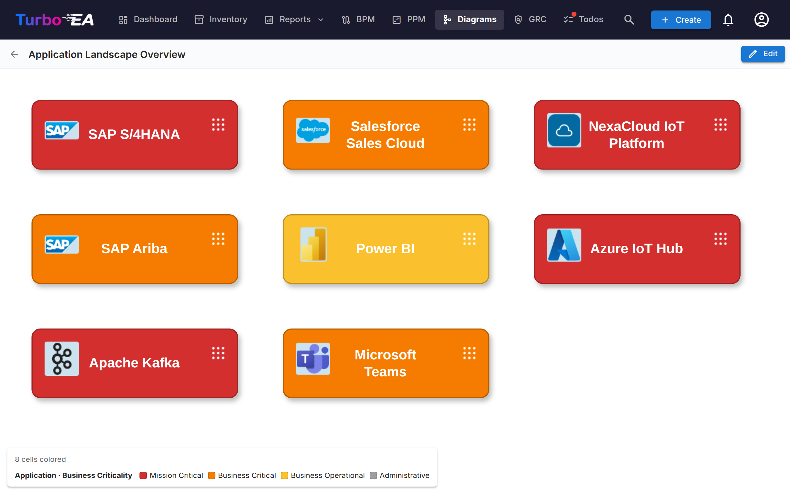
A floating legend in the bottom-left shows one scale per active rule. Field rules and Approval status are alternatives rather than layers: choosing one clears the other. Untick every rule and the canvas returns to card colors. The choice is saved with the diagram. The same legend is shown when the diagram is opened in view mode and on its published or embedded link, so readers can tell what the colours mean.
Show on card
A second toolbar button, Show on card, chooses what each shape says. Tick the card type, the subtype, the alias (shown as an Alias: line, only on cards that have one), or any attribute from the card types currently on the canvas, and each shape gains small detail lines under its name. Fields are listed under the card type they belong to, with any field several of those types share grouped under Shared. It is a separate button from Color by so that neither list has to be scrolled past to reach the other. Clear all empties every tick at once.
Every selection is drawn on the shape, and the shape grows to hold it. Two rows fit in a card as it stands, so nothing moves until you tick a third; from there each card gets a little taller per selection and shrinks back when you untick one. A card you have resized by hand keeps your height: it only gains or gives back the room a row needs.
These lines are saved with the diagram, so every reader — including anyone opening a published link — sees the same shapes. Cards pulled onto the canvas by Expand carry the same rows as any other card and grow the same way. Cards tiled inside a Drill-Down or Roll-Up container show what fits in their slot: growing one would push it over the row beneath. The container's own title bar, though, grows to hold its rows — and its contents move down with it — so turning a card into a container never costs you what it was saying.
The Create diagram button on the Dependencies report carries its own card-display settings across, so a diagram generated from a report opens showing exactly the rows the report showed — all of them, even the ones the report itself had no room to draw.
How relation edges are drawn
Every Turbo EA relation looks the same on the canvas however it got there — drawn by hand with the relation picker, or pulled in from the inventory with the + / Expand menu:
- One neutral dark-grey line, not the colour of the card at the other end. An edge is a relation; tinting it by card type only restates what the node already says.
- An arrowhead on the target end, so the direction reads at a glance without reading the verb. Pull in a relation that points at the card you expanded and the arrowhead sits on the other end.
- The verb reads in the arrow's direction. Since the arrowhead marks the relation's target, the label always completes the sentence tail → verb → head. That means a link reads the same whichever card you expanded from: expand an Organization and you see uses; expand one of its Applications and the organisations coming back still read uses, with the arrow pointing the other way.
- A dashed line while the relation is still pending, turning solid once it has been pushed to the inventory.
Provider and consumer
Some relations carry a flow direction — most importantly the link between an Application and an Interface, where one application provides the interface and others consume it. Set it in the relation dialog when you draw the link (or from the card's Relations section afterwards), and the arrowhead follows the data rather than the relation:
| Flow direction | Arrowhead |
|---|---|
| Provider (source → target) | points at the Interface |
| Consumer (target → source) | points back at the Application |
| Bidirectional | arrowheads at both ends |
This matches what the Layered Dependency View already draws, so a diagram and a dependency report agree. Links where the flow direction was never set keep the plain relation-direction arrow — the information has to be in the model before a diagram can show it.
Hiding relation labels
Every relation edge carries its verb — provides, consumes, supports. On a dense landscape that quickly becomes more noise than information, so the ⋮ overflow menu offers Hide relation labels (and Show relation labels to bring them back).
This is display-only: the relation itself is untouched, so hiding is free to undo. The setting is saved with the diagram, so the read-only viewer, any published diagram and PNG/SVG exports all match what you arranged. Edges you draw afterwards follow the current setting. Annotation edges you labelled yourself are left alone — only Turbo EA relation edges are affected.
Sync drawer
The Sync button in the toolbar opens the side drawer with everything queued for the next sync:
- New Cards — shapes converted to pending cards, ready to be pushed to inventory.
- New Relations — edges drawn between cards, ready to be created in inventory.
- Removed Relations — relation-edges deleted from the canvas, queued for
DELETE /relations/{id}. Keep in inventory re-inserts the edge. - Hierarchy Changes — confirmed drag-into / drag-out container moves, queued as
parent_idupdates. - Inventory Changed — changes made in the inventory since the diagram was saved, ready to be pulled back into the canvas. Each row offers the matching action, and Accept all resolves every row at once:
- a renamed card — Accept update rewrites the cell label;
- a deleted or archived card — Remove from diagram takes the cell (and its edges) off the canvas;
- a deleted relation — Remove edge from diagram takes the stale edge off the canvas;
- a relation whose flow direction changed — Accept update moves the arrowhead to match the inventory.
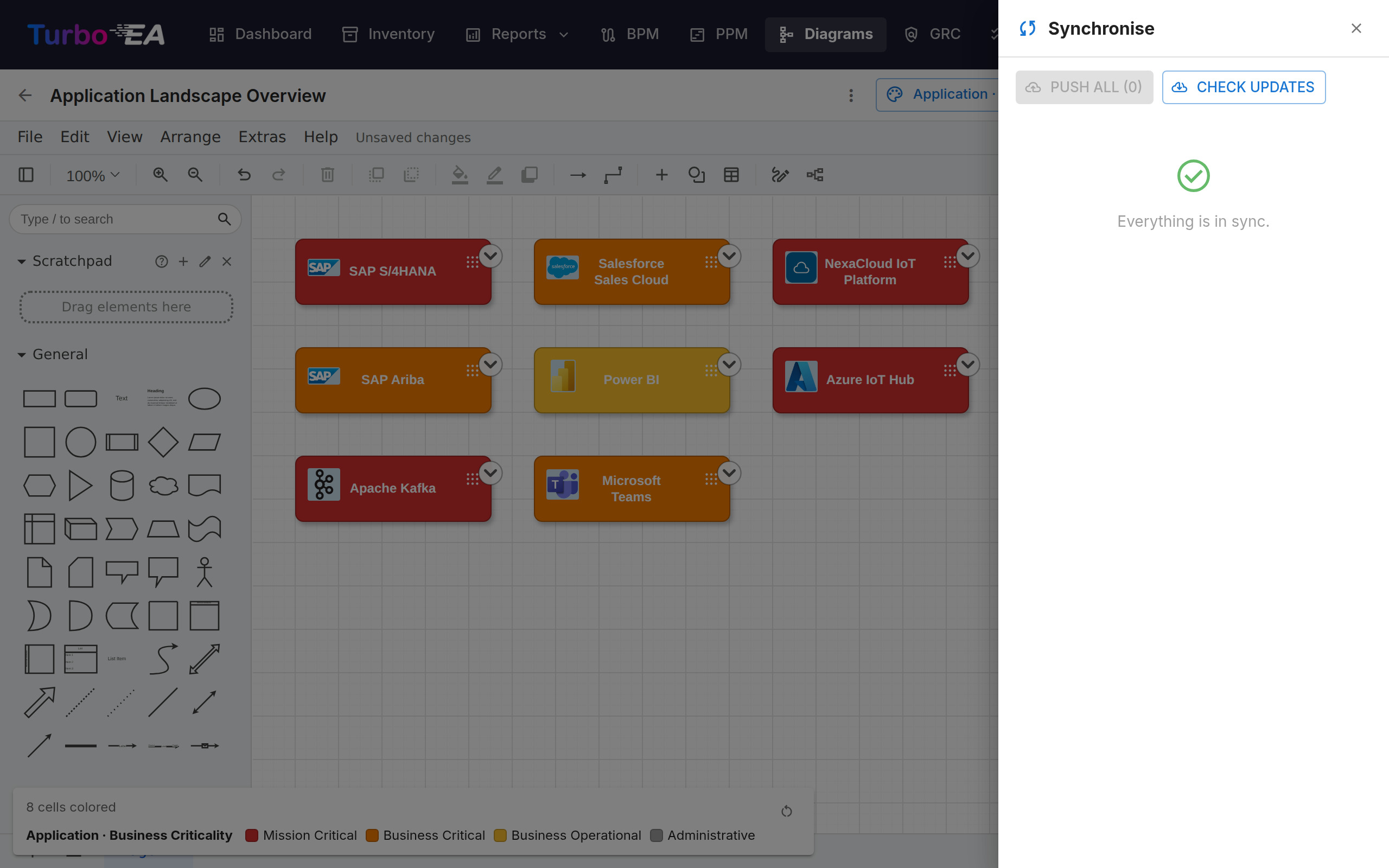
Turbo EA checks for inventory changes automatically every time you open a diagram — a blue badge on the toolbar Sync button counts the changes awaiting review. Nothing is applied without your confirmation; the badge only invites you into the drawer. The Check updates button in the drawer re-runs the same check on demand.
The toolbar Sync button shows a pulsing "N unsynced" pill whenever pending work exists. Leaving the tab with unsynced changes triggers a browser warning, and the canvas autosaves to local storage every five seconds so an accidental refresh can be restored on reopen.
Linking diagrams to cards
Diagrams can be linked to any card from the card's Resources tab (see Card Details). When linked to an Initiative card, the diagram also appears in the EA Delivery module alongside SoAW documents.
Sharing a diagram outside Turbo EA
A diagram can be published as a read-only link that opens without signing in, so it can be embedded in a wiki page such as Confluence.
Open the diagram's ⋮ menu in the gallery and choose Share / embed…. Publishing requires the Publish diagrams permission, which is separate from the permission to edit them — an administrator grants it deliberately.
The dialog gives you two choices and two strings to copy:
- Anyone with the link — no sign-in. Treat the link like a password: anyone it is forwarded to can view the diagram.
- Only people who sign in — visitors authenticate with your identity provider, optionally restricted to named email domains. No Turbo EA account is created for them. Inside an embed, the sign-in opens in a small pop-up window, and Turbo EA must be served over HTTPS for the session to hold inside the frame; visitors sign in once per site the diagram is embedded in.
The published page shows the picture only. It is pannable and zoomable, but there is no click-through to card details, and the card identifiers behind the shapes are stripped before the diagram leaves the server. Turning publishing off takes effect immediately, including for anyone already viewing. Re-publishing later restores the same link, so URLs already pasted into a wiki keep working.
Embedding needs one administrator step
For security, no other website may place Turbo EA in a frame unless an administrator says so. Set TURBO_EA_EMBED_ALLOWED_ORIGINS in .env to the sites allowed to embed diagrams and restart the stack:
TURBO_EA_EMBED_ALLOWED_ORIGINS=https://yourcompany.atlassian.net
Until that is set, published links still work when opened directly — they just cannot be framed by another site.
Embedding in Confluence
- Publish the diagram and copy the Embed code from the Share dialog.
- Ask an administrator to add your Confluence base URL to
TURBO_EA_EMBED_ALLOWED_ORIGINS. - In Confluence, insert an HTML macro (or Iframe / HTML include, depending on what your instance allows) and paste the embed code.
If your Confluence does not allow HTML macros, paste the plain Link instead — it opens the same view in a new tab.
Sign-in inside an embed
A diagram published for Only people who sign in shows a Sign in button inside the embed. It opens your identity provider in a small pop-up window, and the diagram appears once that window closes. Three things can get in the way: Turbo EA must be served over HTTPS (browsers only keep the cross-site session an embed needs on a secure origin); the embedding page must allow pop-ups from its frames (a sandboxed frame without allow-popups blocks both the pop-up and the fallback link); and in Safari, use the Open the diagram in a new tab link the gate offers. Separately, Chrome refuses to load an embed from a private-network address (an internal IP or hostname) into a public page such as Confluence Cloud — publish the instance on a public HTTPS hostname, or embed it from a wiki on the same network.