Card Details
Clicking on any card in the inventory opens the detail view where you can view and edit all information about the component.
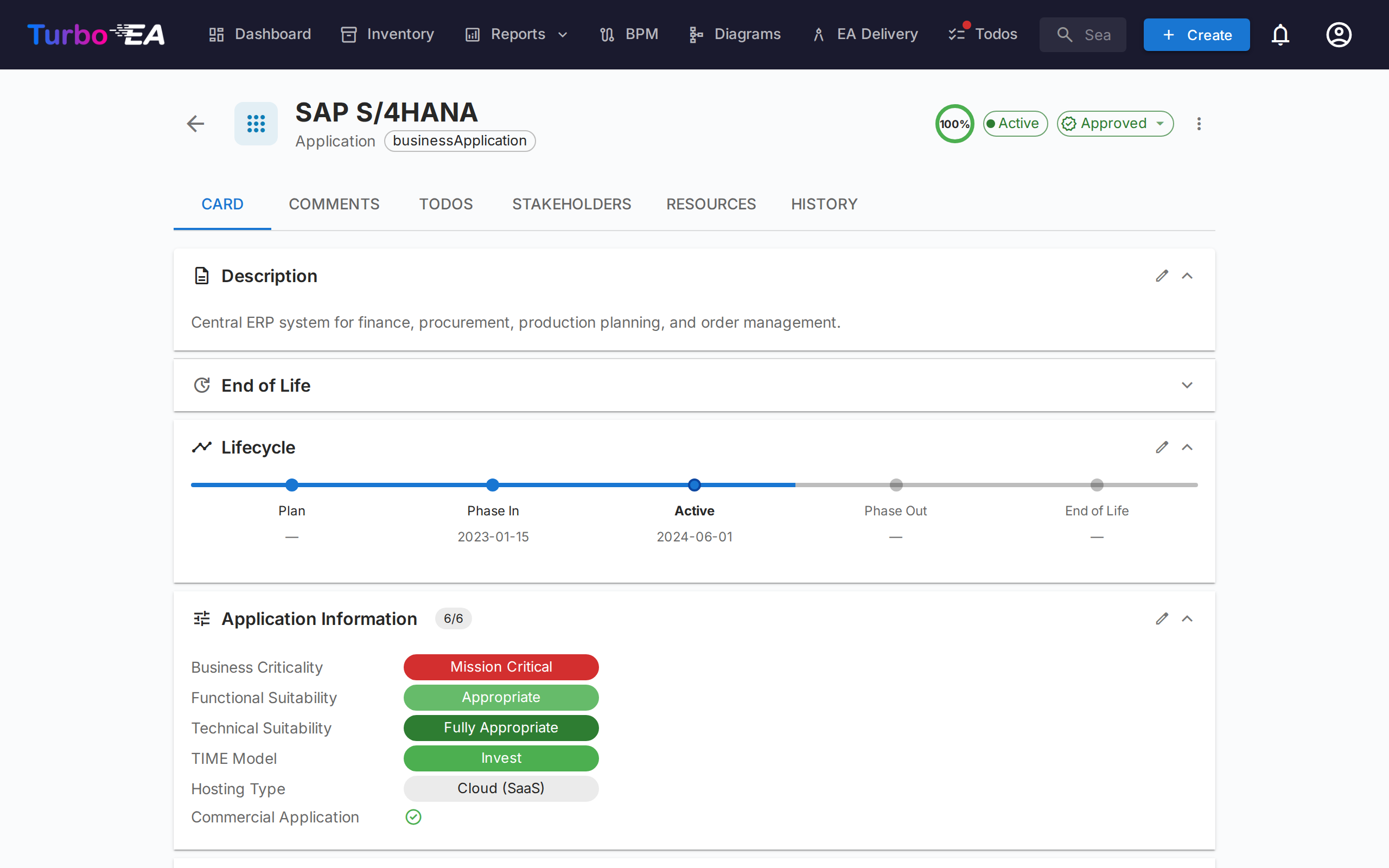
Card Header
The top of the card shows:
- Type icon and label — Color-coded card type indicator
- Card name — Editable inline
- Subtype — Secondary classification (if applicable)
- Approval status badge — Draft, Approved, Broken, or Rejected
- AI suggest button — Click to generate a description with AI (visible when AI is enabled for this card type and the user has edit permission)
- Data quality ring — Visual indicator of information completeness (0–100%)
- Actions menu — Archive, delete, and approval actions. Also includes a one-click Observe this card toggle (when the card type defines an Observer role) so any user with view access can follow the card without going through the Stakeholders tab.
Approval Workflow
Cards can go through an approval cycle:
| Status | Meaning |
|---|---|
| Draft | Default state, not yet reviewed |
| Approved | Reviewed and accepted by a responsible party |
| Broken | Was approved, but has been edited since — needs re-review |
| Rejected | Reviewed and rejected, needs corrections |
When an approved card is edited, its status automatically changes to Broken to indicate it needs re-review.
Detail Tab (Main)
The detail tab is organized into sections that can be reordered and configured by an administrator per card type (see Card Layout Editor).
Description Section
- Description — Rich text description of the component. Supports the AI suggestion feature for automatic generation
- Additional description fields — Some card types include extra fields in the description section (e.g., alias, external ID)
Lifecycle Section
The lifecycle model tracks a component through five phases:
| Phase | Description |
|---|---|
| Plan | Under consideration, not yet started |
| Phase In | Being implemented or deployed |
| Active | Currently operational |
| Phase Out | Being decommissioned |
| End of Life | No longer in use or supported |
Each phase has a date picker so you can record when the component entered or will enter that phase. A visual timeline bar shows the component's position in its lifecycle.
Custom Attribute Sections
Depending on the card type, you will see additional sections with custom fields configured in the metamodel. Field types include:
- Text — Free text input
- Multi-line Text — Free text input that preserves line breaks, rendered as an auto-growing text area
- Number — Numeric value
- Cost — Numeric value displayed with the platform's configured currency
- Boolean — On/off toggle
- Date — Date picker
- URL — Clickable link (validated for http/https/mailto)
- Single select — Dropdown with predefined options
- Multiple select — Multi-selection with chip display
Fields marked as calculated show a badge and cannot be edited manually — their values are computed by admin-defined formulas.
Hierarchy Section
For card types that support hierarchy (e.g., Organization, Business Capability, Application):
- Parent — The card's parent in the hierarchy (click to navigate)
- Children — List of child cards (click any to navigate)
- Hierarchy breadcrumb — Shows the full path from root to current card
Relations Section
Shows all connections to other cards, grouped by relation type. For each relation:
- Related card name — Click to navigate to the related card
- Relation type — The nature of the connection (e.g., "uses", "runs on", "depends on")
- Add relation — Click + to create a new relation by searching for cards
- Remove relation — Click the delete icon to remove a relation
Tags Section
Apply tags from the configured tag groups. Depending on the group mode, you can select one tag (single select) or multiple tags (multi select).
Resources Tab
The Resources tab consolidates all supporting materials for a card:
- Architecture Decisions — ADRs linked to this card, displayed as colored pills matching their card type colors (e.g., blue for Application, purple for Data Object). You can link existing ADRs or create a new ADR directly from the Resources tab — the new ADR is automatically linked to the card.
- File Attachments — Upload and manage files (PDF, DOCX, XLSX, images, up to 10 MB). When uploading, select a document category from: Architecture, Security, Compliance, Operations, Meeting Notes, Design, or Other. The category appears as a chip next to each file.
- Document Links — URL-based document references. When adding a link, select a link type from: Documentation, Security, Compliance, Architecture, Operations, Support, or Other. The link type appears as a chip next to each link, and the icon changes based on the selected type.
- Diagrams — Link existing diagrams to this card. Linked diagrams appear as thumbnail previews that you can click to open in the diagram editor. Use the Link Diagram button to search for and attach an existing diagram, or click the unlink icon to remove the association.
EOL Section
If the card is linked to an endoflife.date product (via EOL Administration):
- Product name and version
- Support status — Color-coded: Supported, Approaching EOL, End of Life
- Key dates — Release date, active support end, security support end, EOL date
Comments Tab
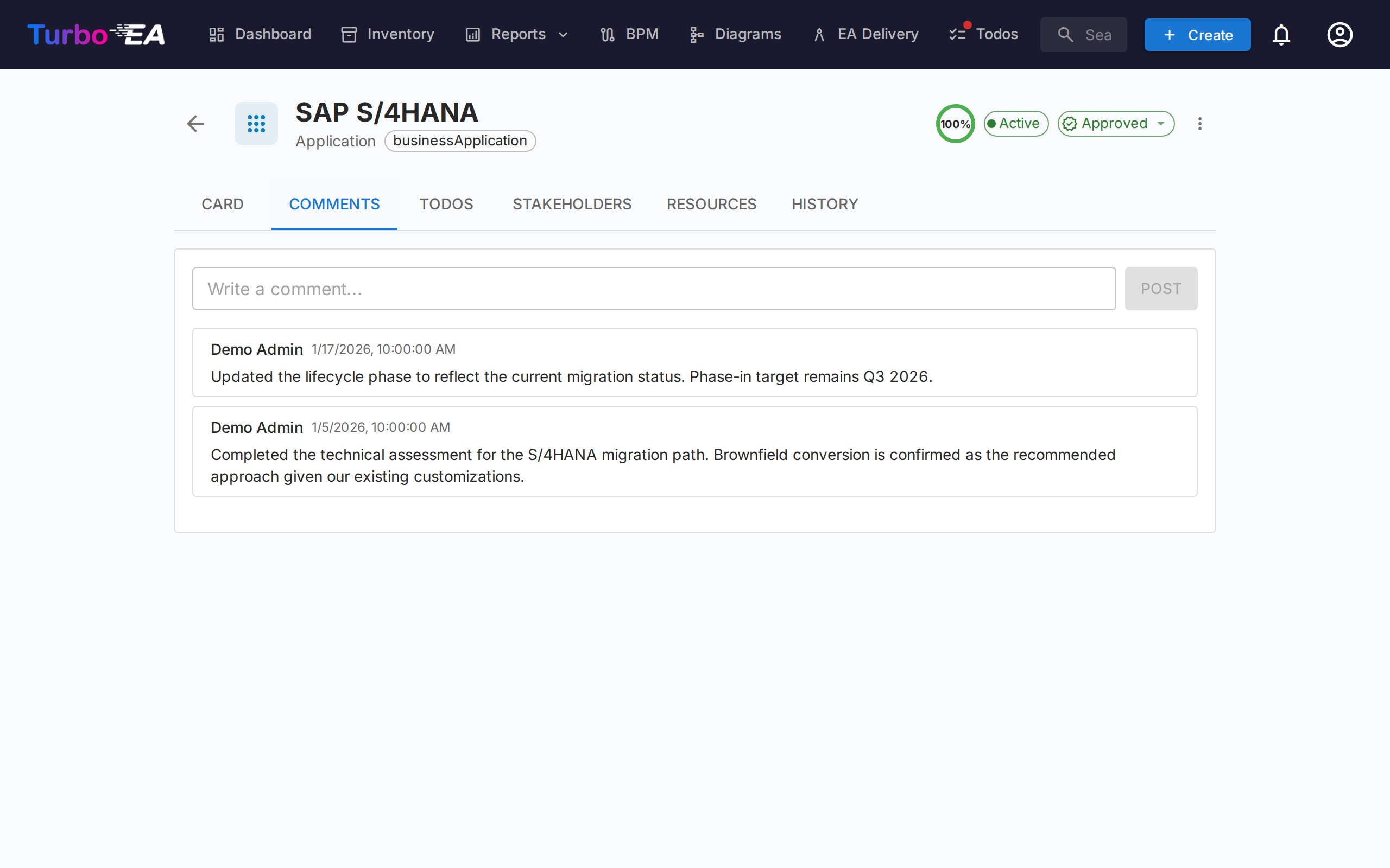
- Add comments — Leave notes, questions, or decisions about the component
- Threaded replies — Reply to specific comments to create conversation threads
- Timestamps — See when each comment was posted and by whom
Todos Tab
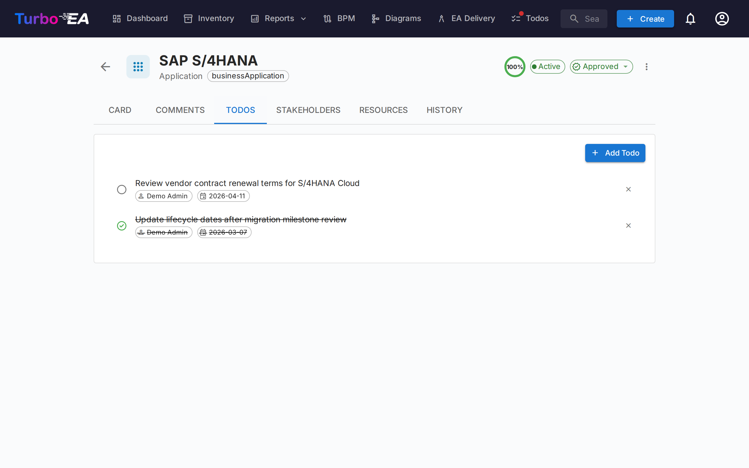
- Create todos — Add tasks linked to this specific card
- Assign — Set a responsible person for each task
- Due date — Set deadlines
- Status — Toggle between Open and Done
- Recurring — Switch on Repeats to make a todo repeat on a schedule (every N days, weeks, months, or years); completing it automatically creates the next occurrence
Stakeholders Tab
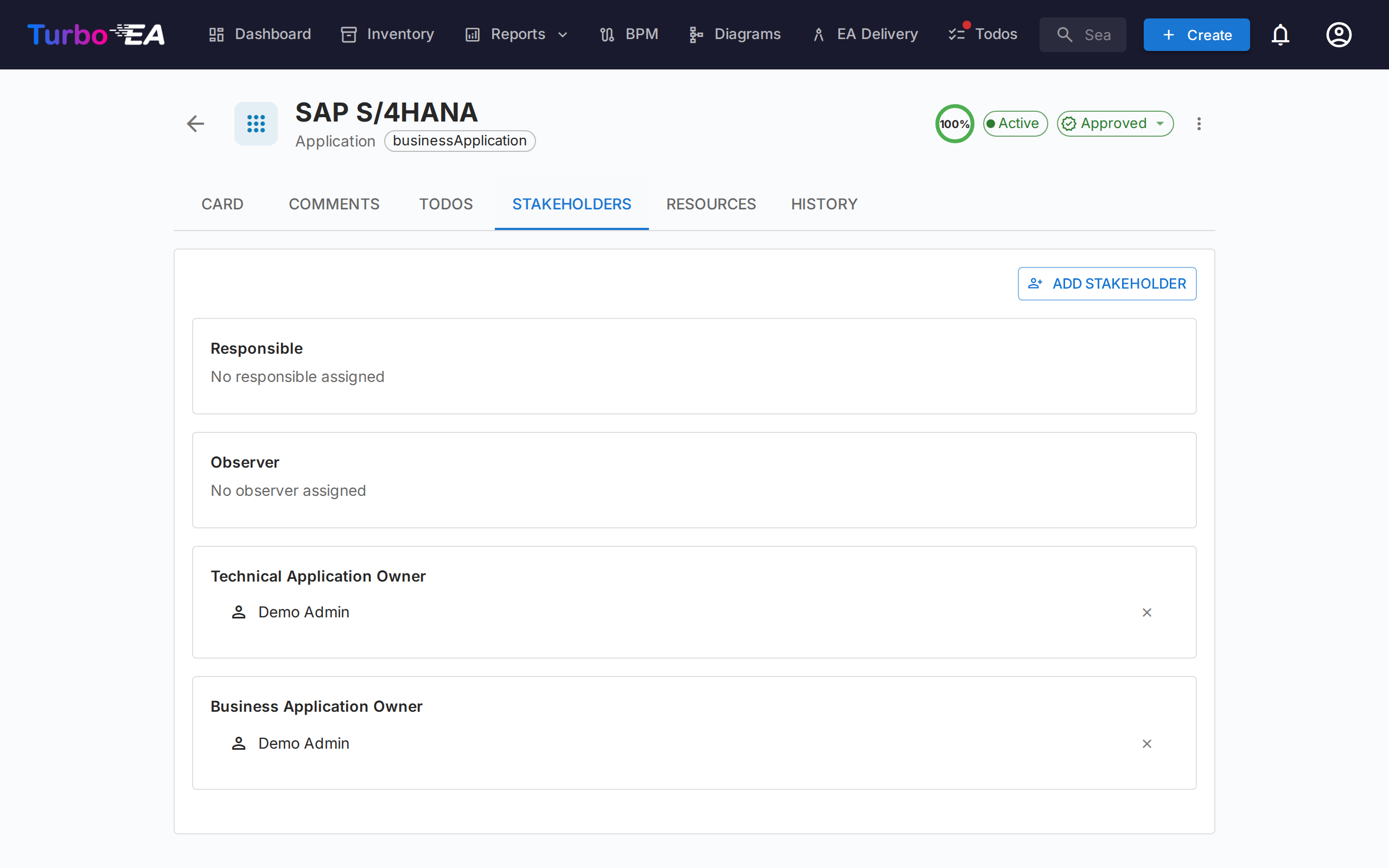
Stakeholders are people with a specific role on this card. The available roles depend on the card type (configured in the metamodel). Common roles include:
- Application Owner — Responsible for business decisions
- Technical Owner — Responsible for technical decisions
- Custom roles — Additional roles as defined by your administrator
Stakeholder assignments affect permissions: a user's effective permissions on a card are the combination of their app-level role and any stakeholder roles they hold on that card.
Searching and inviting
Pick a stakeholder via the searchable autocomplete — start typing and the dropdown filters on both name and email (email appears as the secondary line so two users with the same name can be told apart at a glance).
If the email you type doesn't match an existing user, an "Invite «email» as a new user" option appears at the end of the dropdown. Selecting it expands an inline mini-form right inside the picker — pick a role (Member or Viewer by default), optionally edit the display name, and submit. The new user is invited via the standard invitation email and assigned the chosen stakeholder role on the card in a single action, so you never have to leave the card to onboard a contributor.
The invite path requires the users.invite permission, a delegated form of admin.users that admins can grant to trusted members. A privilege-escalation guard prevents non-admins from inviting users into admin roles — the role dropdown silently filters to roles the inviter is allowed to delegate.
History Tab
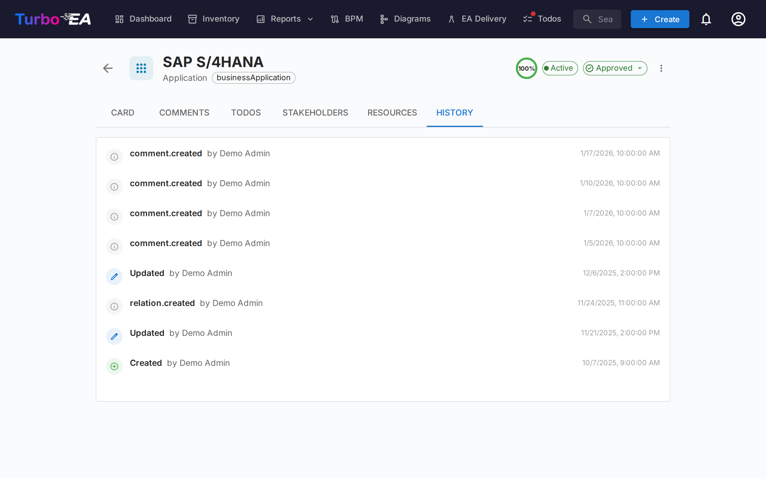
Shows the complete audit trail of changes made to the card: who made the change, when it was made, and what was modified (previous value vs. new value). This enables full traceability of all modifications over time.
Risks Tab (GRC enabled, when present)
When the GRC module is enabled and the card has at least one linked risk, a Risks tab appears listing every risk linked to the card with a one-click path back to the Risk Register. The tab is auto-hidden when no risk is linked, so cards with no GRC activity don't carry an empty tab.
Compliance Tab (GRC enabled, when present)
When the GRC module is enabled and the card has at least one linked compliance finding, a Compliance tab appears listing every finding currently linked to the card. The same Acknowledge / Accept / Create risk / Open risk actions as the GRC Compliance grid are available so the card owner can triage their own findings without leaving the card. Auto-hidden when no finding is linked.
Process Flow Tab (Business Process cards only)
For Business Process cards, an additional Process Flow tab appears with an embedded BPMN diagram viewer/editor. See BPM for details on process flow management.
PPM Tab (Initiative cards only)
When the PPM module is enabled, Initiative cards display an additional PPM tab as the last tab. Clicking this tab navigates to the PPM Initiative Detail View where you can manage status reports, budgets, risks, tasks, and Gantt timelines.
Archiving
Cards can be archived (soft-deleted) via the actions menu. Archived cards:
- Are hidden from the default inventory view (visible only with the "Show archived" filter)
- Are automatically permanently deleted after 30 days
- Can be restored before the 30-day window expires